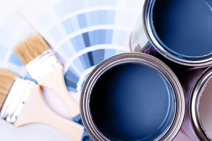
Color therapy, also known as chromotherapy, suggests that different colors can impact our mood, emotions, and even productivity. When applied to interior design, paint colors can create environments that support well-being and improve performance. Here’s how different colors are commonly associated with various psychological effects:
1. Calming and Relaxation
- Blue: Often linked with calmness and serenity, blue can lower stress and promote a sense of peace. It’s great for bedrooms or bathrooms where relaxation is important.
- Green: Associated with nature and balance, green provides a refreshing, tranquil atmosphere. Ideal for home offices or living rooms, it promotes a sense of calm without being too sedative.
2. Energy and Motivation
- Yellow: A bright, cheerful color, yellow stimulates positivity and creativity. It’s perfect for kitchens, dining areas, or workspaces where energy and an uplifting mood are beneficial.
- Orange: A warm and enthusiastic color that encourages social interaction. Best used in living rooms, playrooms, or creative spaces to enhance motivation and communication.
3. Focus and Productivity
- Light Gray: Neutral and sophisticated, light gray can enhance concentration without being too distracting. It’s commonly used in home offices or study spaces where focus is key.
- White: Clean and crisp, white fosters a sense of clarity. It’s a versatile backdrop that can be invigorating, making it ideal for productivity areas like workspaces or kitchens.
4. Comfort and Intimacy
- Warm Earth Tones (Beige, Taupe): These cozy, grounding colors promote a sense of warmth and comfort, making them suitable for living rooms and bedrooms where relaxation and intimacy are desired.
5. Inspiration and Creativity
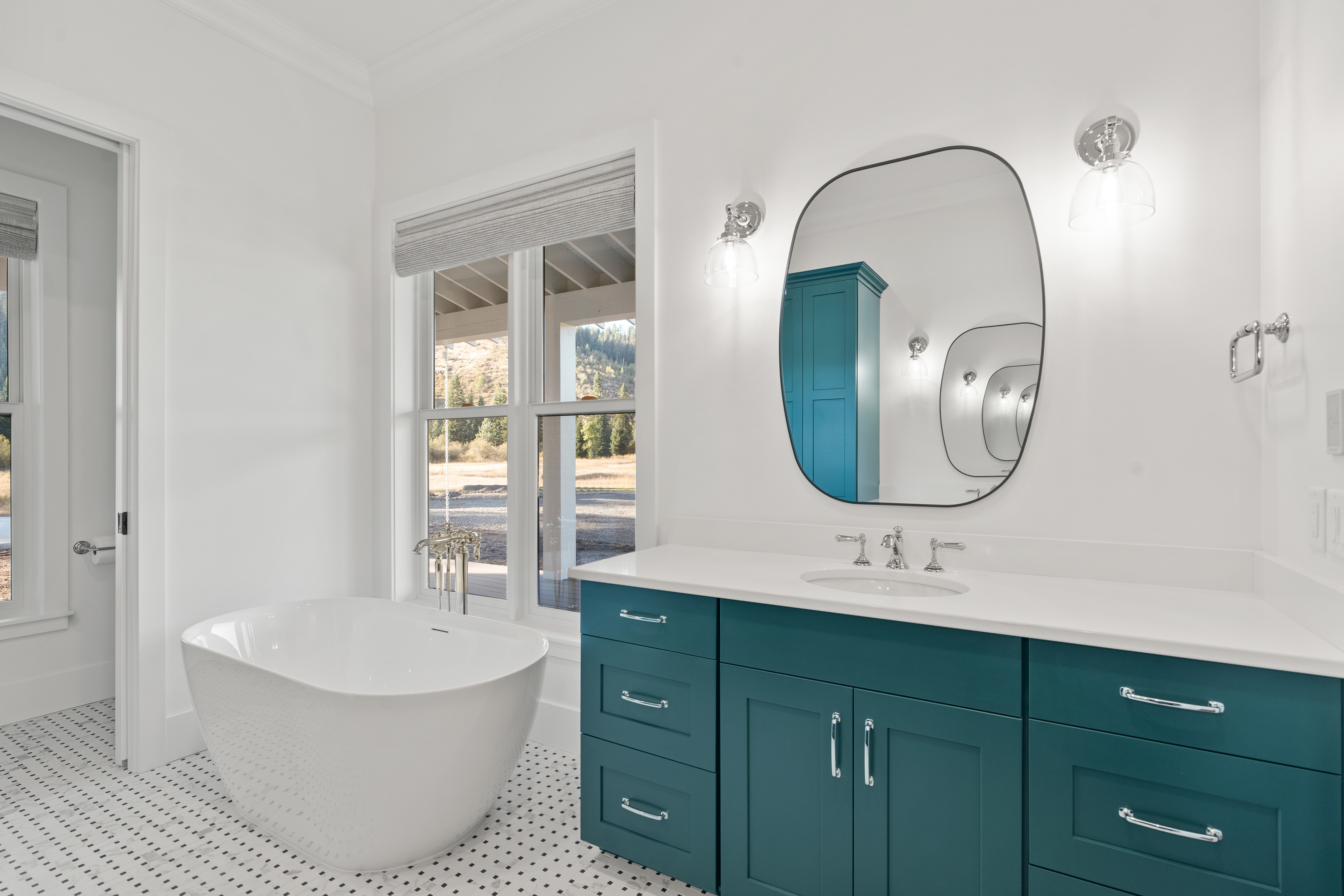
- Purple: Associated with luxury, creativity, and introspection, purple can stimulate imagination. Deep purples like eggplant can be dramatic, while lighter shades like lavender evoke a sense of calm creativity.
Practical Tips:
- Room Function: Consider how you use the room. Relaxation zones benefit from cooler tones, while productive areas may benefit from warmer or more neutral shades.
- Natural Light: Colors look different depending on the natural light in a room. Spaces with more light can handle bolder colors, while dim rooms may need lighter shades to feel more open.
- Personal Preferences: Color associations can be personal, so choose hues that resonate with you and your desired mood.
Would you like suggestions for specific rooms in your home? Contact us at (208) 762-7432 or schedule a free consultation with the link from our website header.